Canonical
on 28 June 2013
In my previous blog post, we looked at the key screens for Shorts, the organic grid and the reading view. You can read about the list view behaviour in this document. In this post, I would like to look at journeys for adding and editing content, sharing an article and adjusting the reading view.
Sharing and adjusting the reading view
From the reading view, pull up the toolbar to reveal options:
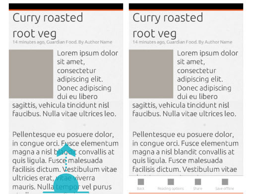
Options for adjusting the reading view are:
- Font size
- Light / dark theme
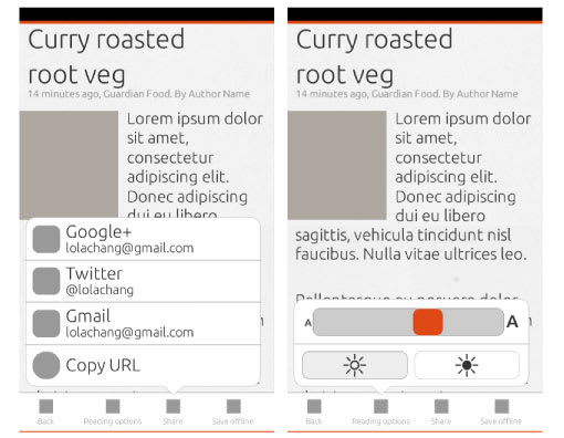
Any changes made to the reading view are persistent until the view is changed again.
Adding things to read
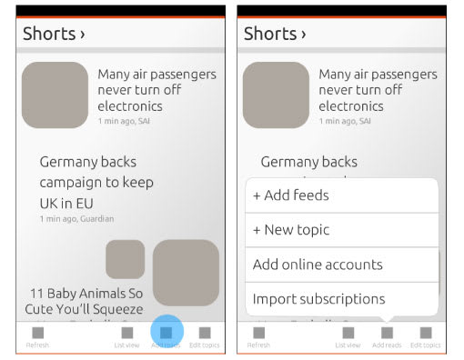
There are different options for adding content to the Shorts app. All of the options described here are for when the user already has feed subscriptions in the app; the first use scenario is not yet covered. To get to the different options for adding content, pull up the toolbar from the topic view:
1. Adding a topic
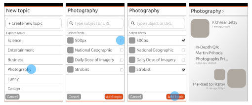
Adding a new topic with feed suggestions makes finding things to read much easier for users who don’t understand RSS. However, suggesting feeds for subjects could easily become quite complex; for example feeds related to ‘News’ are location specific. Whether we can suggest feeds for users will depend on if we can automate this process.
2. Adding feeds
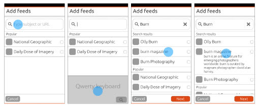
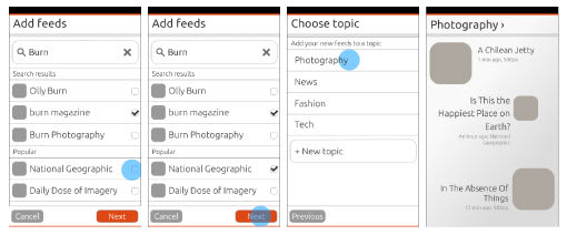
When adding one or more feeds, the user needs to select a topic to organise it under. Selecting the topic is done with the expanded option selector.
3. Add online accounts
This might not be possible for version 1, but being able to read articles that were posted on your social networks would be a great feature to have in Shorts. Connecting to social networks will be done through Ubuntu Online Accounts.
4. Import subscriptions
Exact functionality for importing and exporting subscriptions will depend on the how the file manager works.
5. Other
Depending on browser functionality, it might be possible to add feeds from the browser.
Edit topics
In Shorts, feeds are organised under topics. Occasionally, users might want to change the names of their topics and the organisation of their feeds. Under ‘edit topics’, users can:
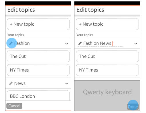
1. Change topic names
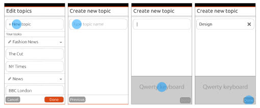
2. Change topic organisation by adding a new one
3. Moving feeds into a different topic
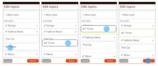
The above proposal lets users drag feeds from one topic and drop it into another. The list of feeds under a topic could be very long, so there is an option to collapse the topic. Whether this is possible depends on the drag and drop pattern available in the SDK. Drag and drop is not the easiest thing to do on a touchscreen. A possible alternative would be to long-press on a feed, go into selection mode and have move topic as one of the options.
4. Deleting feeds or entire topics
Same as in the messaging menu, we will use the swipe to delete pattern – this will soon be in the app design guides.
Next steps
We aim to make the app powerful but simple by having the more complex options easily accessible where they are needed, and to cater for both advanced and novice users. Do you think this app can work without pages and pages of settings? Looking forward to hear your feedback and ideas. You can follow our progress on Google+, the Ubuntu Phone mailing list and IRC channel. Next thing to do is look at first use and no content scenarios.


