Your submission was sent successfully! Close

Thank you for signing up for our newsletter!
In these regular emails you will find the latest updates from Canonical and upcoming events where you can meet our team.Close

Thank you for contacting us. A member of our team will be in touch shortly. Close

An error occurred while submitting your form. Please try again or file a bug report. Close

  1. Blog
  2. Article

Tom Macfarlane
on 13 March 2014

MWC 2014 – A strong design coherence in everything we do


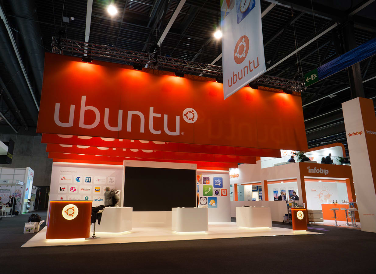
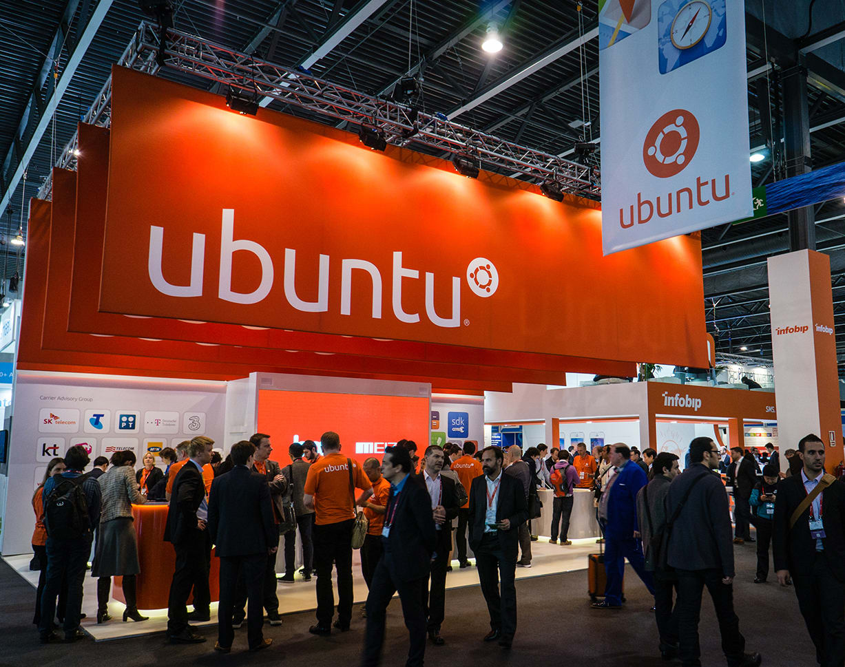
Last month at Mobile World Congress Ubuntu’s presence was stronger than ever. Our third year at MWC and we made some significant design changes to our stand.

In such a large exhibition space, strong branding is key. We designed five large banners – made from fabric and stretched across metal frames – that were suspended above the stand. Each banner was then individually illuminated by a series of spotlights creating maximum impact and high level brand presence, while still maintaining the stands open and welcoming feel.

The back walls and a new hanging aisle banner all featured the folded paper background with large graphics showcasing app and scope designs from the phone and tablet. We also dedicated one wall to the Ubuntu Carrier Advisory Group (CAG).

Continuing our clean and precise design approach we used the Ubuntu shape (the squircle) to create bespoke pods, reception desk and demo unit – with warm white LED down lighting around the top and base and lightboxes to illuminate the Circle of Friends on the reception desk.

Integrating elements from our phone and tablet design across print and 3D environments builds a strong brand/design coherence in everything we do. We’re very happy with the new stand design and feedback from MWC has been very positive.

http://news.softpedia.com/news/Ubuntu-s-Booth-at-MWC-2014-Looks-Spectacular-428834.shtml

Related posts


Maximilian Blazek
10 November 2025

Generating accessible color palettes for design systems … inspired by APCA!

Ubuntu Article

This is the first of two blog posts about how we created the color palette for a new design system at Canonical. In this post I share my journey into perceptually uniform color spaces and perceptual contrast algorithms.  If you’re already familiar with these concepts, skip to this section (or visit the Github repository) to ...


Leia Ruffini
9 September 2025

How we ran a sprint to refresh our design website, Part 2

Design Article

Part 2 of our series on how our team created content for our design website. Get insights, tools, and lessons to help you run your own design sprint. ...


Erin Conley
10 July 2025

In pursuit of quality: UX for documentation authors

Documentation Article

Canonical’s Platform Engineering team has been hard at work crafting documentation in Rockcraft and Charmcraft around native support for web app frameworks like Flask and Django. It’s all part of Canonical’s aim to write high quality documentation and continuously improve it over time through design and development processes. One way we i ...