Inayaili de León Persson
on 30 October 2012
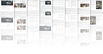
It’s been a long time coming, but we’ve finally done it: the Design Blog has a new look!
Let me take you through the main aspects we wanted to improve on.
Why change?
The last blog design was nearly four years old. With its small font sizes and crammed pages, the text was difficult to read and the images didn’t have space to breathe.
In updating it, we wanted it to appear lighter and cleaner. We wanted to move the visual design forward and let the living and breathing parts of the site — the articles and images themselves — take centre stage.

The new Team page
A focus on content and flexibility

One of the main objectives of this new design was to make the reading experience more pleasurable, losing unnecessary details that were crowding the page, so our readers can focus on the content.
We needed a design that could accommodate not just the content we have now, but also the kind of content we expect to see in the future. So we’ve introduced a grid that’s flexible as well as strong. It makes the article pages look more balanced and harmonious, making it easier for the reader to focus on the text and the images.
Speaking of images, we also wanted to make it easier for authors (and encourage them) to include large images in their articles, if available, to really show off the work.
It all comes down to flexibility: an article page should look great when it has no images at all, but the grid and the design should be flexible enough that, when images exist, they are allowed to shine.
The Ubuntu font
Our font is beautiful, but we weren’t using it to its full potential before. One of the goals of this design is to show off the Ubuntu font, its different weights and how great it works at different sizes.
This an example of a block quote, showing the flexibility of the Ubuntu font.
We increased the baseline font size and started applying a new typographic scale (based on a modular scale) which we will introduce to the main websites soon.
Small screens
Although we have taken steps to improve the way content displays on small screens, there are still a few more things we can do to improve the browsing experience on mobile devices.
Because the new design is so clean, it reads well on smaller screens, especially the article pages, which are the most important part of the blog. Other elements, like the footer and navigation, have been tweaked slightly for easier access on smaller screens.
What’s next
As with most projects, we’re not done yet. There are a few things that we’d like to improve further — like the small-screen experience — and some more functionality we’d like to add, but we believe this is a good first step.
As you can see now, the URL for this blog remains associated with Canonical. Another important point we need to address is the relationship between this blog and the Ubuntu Brand Guidelines site, as they are in fact just two aspects of the overarching Ubuntu design concept.
Now let’s hear your thoughts! What do you think of this updated design? And what would you like to see us writing about in the future — what would make interesting articles for you?


